The five-tone trick that does more for your painting than any colour you'll ever mix.
People come to painting for the colour. Of course they do — colour is the seductive part, the bit that looks like magic. But if I had to name the single thing that separates a painting that works from one that doesn't, it wouldn't be colour at all.
It would be tone.
Tonal value — how light or how dark something is — is the foundation everything else sits on. Colour is secondary. Tone is what creates form, depth, and the whole illusion of light falling across a surface. Get the tone right and you can be surprisingly loose with the colour. Get the tone wrong and no amount of beautiful colour will save it.
The problem is that tone is genuinely hard to see, because your eye keeps getting distracted by all that lovely colour. So you have to train yourself to see past it.
How to See Tone
There are three reliable tricks, and you should use all of them.
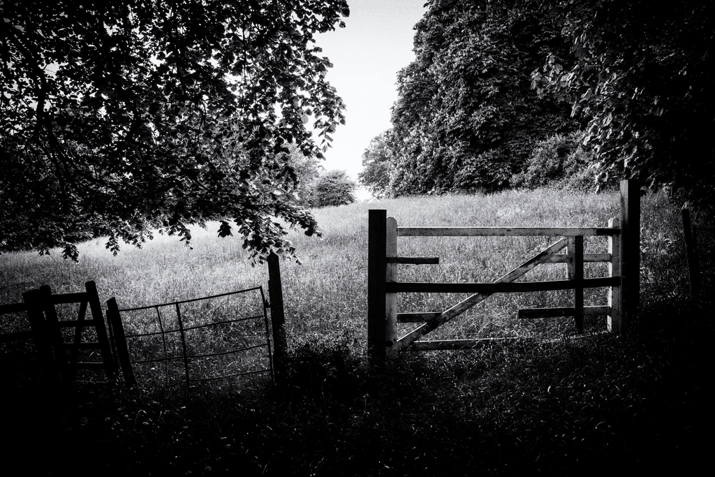
Squint. Close your eyes almost completely and look at your subject through your lashes. The blur strips out the colour information and leaves you with the tonal structure. Suddenly it's obvious which areas are darkest and which are lightest. This is the fastest tool you have, and it's free.
Stand back. Paintings and subjects both look completely different from a distance. Walk away from your easel. Details vanish, and the relationships between light and dark snap into focus. If something feels off and you can't say why, stepping back will usually show you.
Convert to greyscale. If you're working from a photo, put a black-and-white filter on it on your phone. The tonal map of the whole image appears instantly — no colour to argue with.
The Five-Tone Trick
Here's the part that makes it usable.
Don't try to paint every subtle shift of light. You don't need to. Train yourself to think of your whole painting as just five tones:
- White — the paper itself, your lightest light
- Light
- Mid
- Dark
- Darkest
That's it. Five zones. You very rarely need more than that, and trying to use more usually just muddies things up.
Before you start painting, simplify your subject into these five tones. Squint at it and ask: where's the white? Where's the darkest dark? Then place the lights, mids, and darks in between. You're not tracing reality — you're sorting it into five buckets.
Why This Works
Once you're thinking in five tones, a lot of other things fall into place.
You'll naturally start painting light to dark, the way watercolour demands — because your white is the paper, and once you've covered it, it's gone. So you plan your lightest areas first and leave them alone.
You'll also start placing your strongest contrast — your darkest dark against your lightest light — exactly where you want the eye to land. That's where attention goes. Use it deliberately, and you've got a painting that leads the viewer instead of confusing them.
The thing most students skip is the transitions — the mid-tones that carry the eye from light to dark. They jump straight from pale to dark and the form falls flat. Don't skip the middle. That's where the form actually lives.
So before you reach for colour next time, do the unglamorous thing first. Squint. Find your five tones. Sort the whole scene into white, light, mid, dark, and darkest. Get that right, and the colour — whatever colour you choose — will have something solid to sit on.
Stop seeing colour for a minute. Start seeing value. Your paintings will thank you for it.